
New Data Grid control in Canvas apps
Microsoft recently announced the "What’s new in Power Platform: May 2026 feature update". You can read the full announcement covering all the new features here.
One of the announcements is the new Data grid control in Canvas apps. It is now in public preview, so this is a good time to take a closer look at it!
You can find the documentation for this control here: Data Grid modern control in canvas apps (preview)
Add a Data grid control
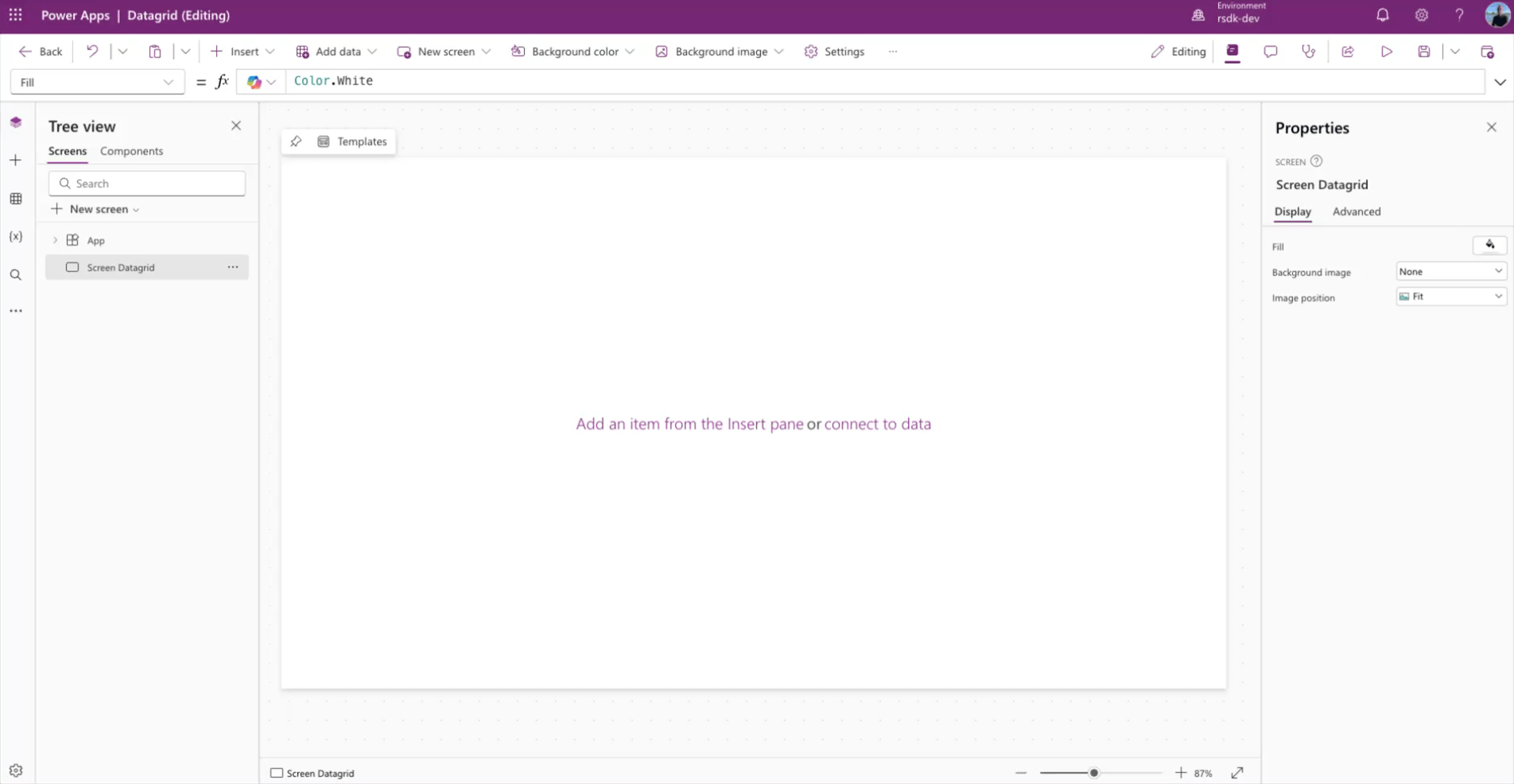
Open a Canvas app, or create a new one. In this example, we start with a blank screen.
Click Insert and choose data grid (Preview).
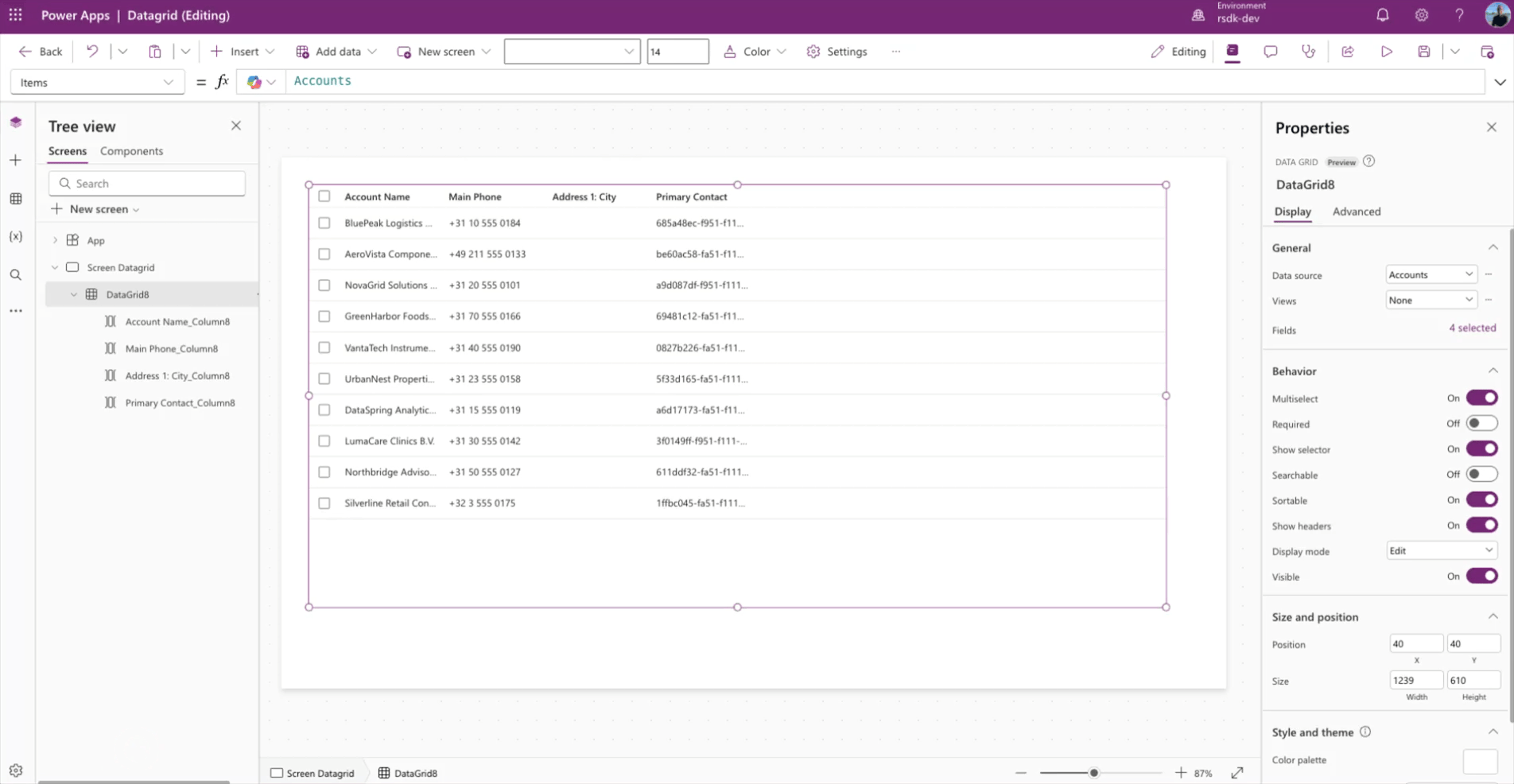
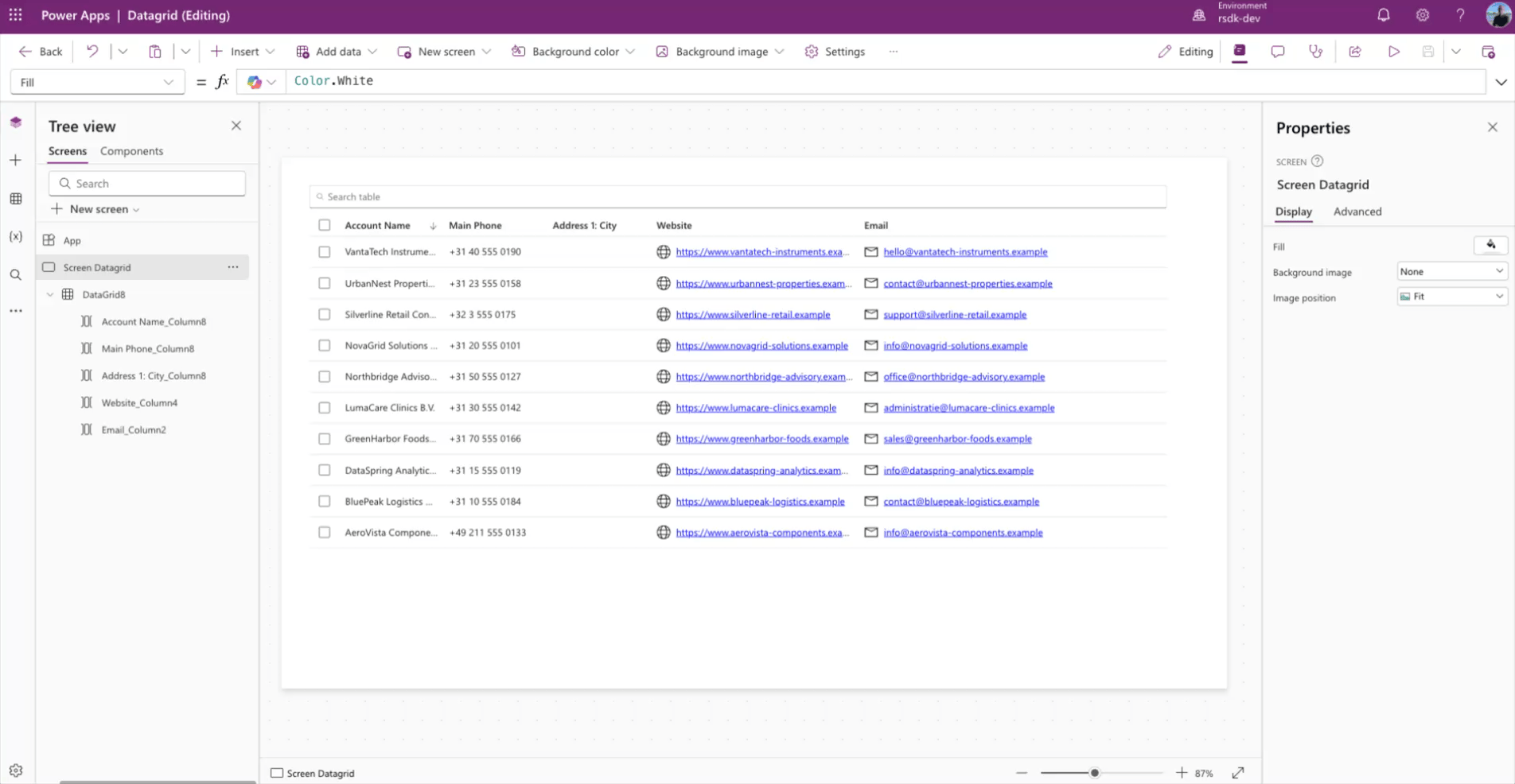
Next, select the data source you want to add to the data grid. In this example, we use the Dataverse Accounts table.
Add and remove columns
Of course, you can also add or remove columns in this new data grid control. It works the same way as it does in many other controls in Canvas Apps.
In the properties pane, click the X selected link, right next to the Fields property. Then click Add column to add a column, or remove columns that are already connected.
Search
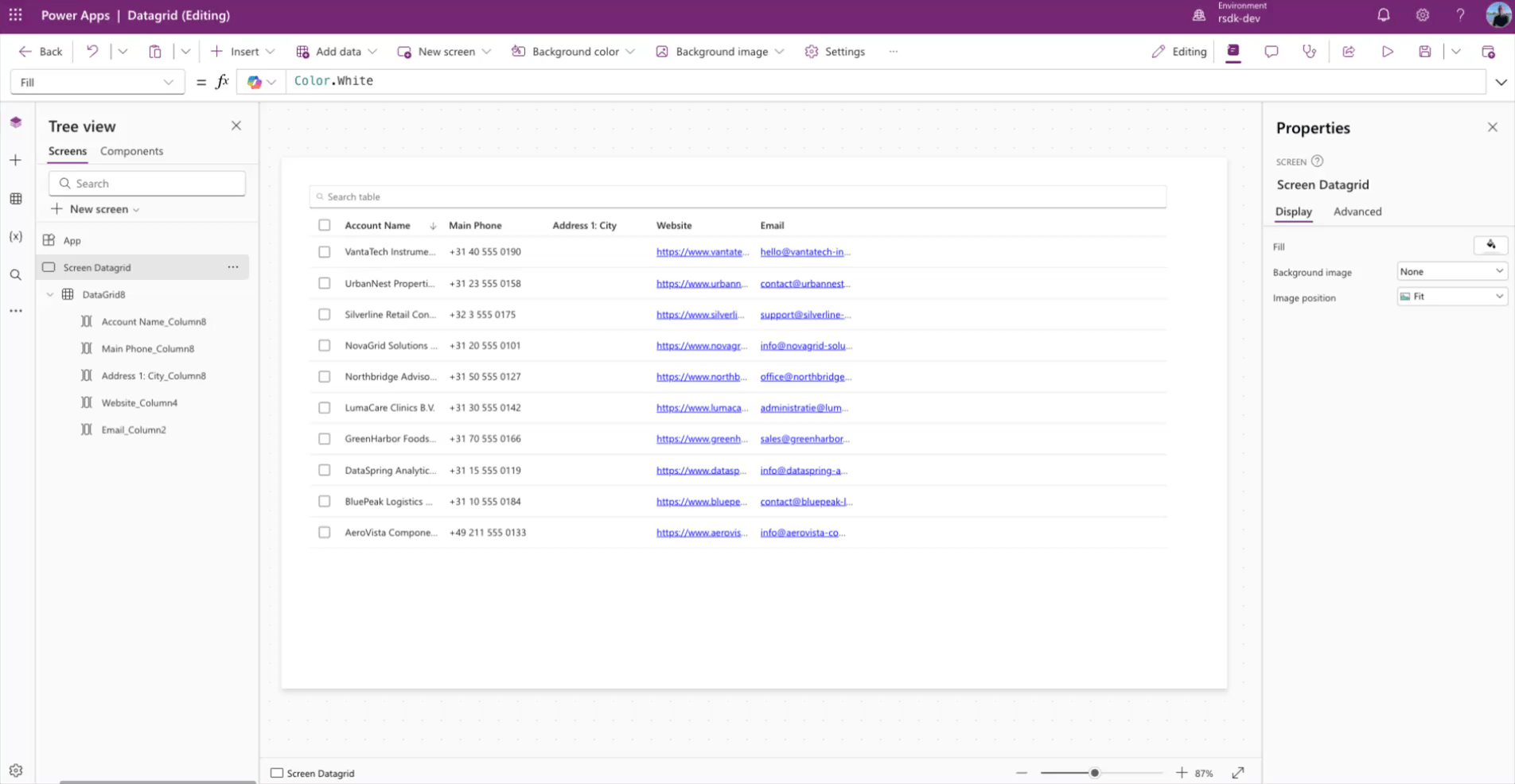
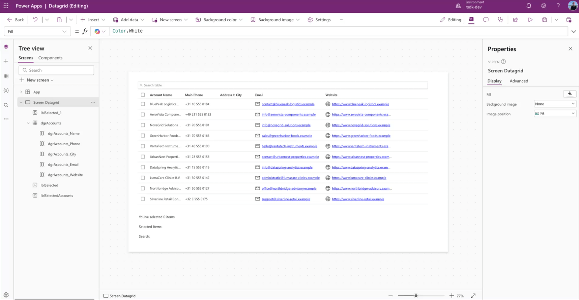
The new data grid control also comes with built-in search. You can turn it on by enabling the Searchable toggle in the properties pane.
Once you enable this feature, a search box appears above the grid. That means you no longer need to build extra logic just to support search.
Column properties
Not only does the data grid component have its own properties, but the selected columns underneath it also have their own settings.
Here, you can set the width of a column, but also things like visibility and wrap.
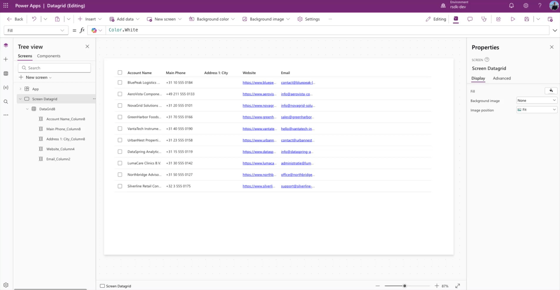
You can also add an icon to a column. In the example below, I do that for the website and Email columns.
For icons, you can use the full list that is also available in the modern Icon and Button controls.
Multiselect
By default, a data grid is added to your canvas as a multiselect grid. If you would rather use a single-select grid, you can simply turn off the Multiselect property.
Process output
The data grid control has several output properties. The familiar Selected and SelectedItems are available, just like in controls such as the Gallery control.
But the Data grid control also includes an extra output property: SearchText. This lets you retrieve the value the user typed into the search box. Just keep in mind that this only works when the Searchable property is set to True.
SelectedItems
Obviously, you do not just want to use a data grid to display information. You will probably want to do something with the selected items too. For that, you use the SelectedItems output property.
For example, you can count the number of selected items in the data grid with the following Power FX code:
CountRows(datagridName.SelectedItems)Or you can retrieve the selected values and show them in a single text string:
Concat(datagridName.SelectedItems,'Column Name')SearchText
To retrieve the value the user typed into the search box, you can use the following Power FX code:
datagridName.SearchTextIn the example below, I show how you can use the output properties mentioned above in your Canvas app.
YAML snippet
If you want to get started right away, copy the YAML below and paste it into your Canvas app. Just make sure you add the Dataverse Accounts table to your app first.
Screens:
  Screen Datagrid:
    Children:
      - lblSelectedAccounts:
          Control: ModernText@1.0.0
          Properties:
            Text: |-
              =$"Selected Items: { Concat(dgrAccounts.SelectedItems,'Account Name', " - ") } "
            Width: =1000
            X: =40
            Y: =644
      - lblSelected:
          Control: ModernText@1.0.0
          Properties:
            Text: =$"You've selected {CountRows(dgrAccounts.SelectedItems)} items"
            Width: =1000
            X: =40
            Y: =602
      - dgrAccounts:
          Control: ModernDataGrid@1.1.0
          Properties:
            Height: =535
            Items: =Accounts
            OnChange: =Set(varSelected, Self.SelectedItems.name)
            Searchable: =true
            Size: |
              =14
            Width: =1239
            X: =40
            Y: =40
          Children:
            - dgrAccounts_Website:
                Control: ModernDataGridColumn@1.1.0
                Variant: Url
                IsLocked: true
                Properties:
                  FieldDisplayName: ="Website"
                  Icon: =Icon.Globe
                  Text: =ThisItem.Website
                  URL: =ThisItem.Website
                  Width: =300
            - dgrAccounts_Email:
                Control: ModernDataGridColumn@1.1.0
                Variant: Email
                IsLocked: true
                Properties:
                  FieldDisplayName: ="Email"
                  Icon: =Icon.Mail
                  Text: =ThisItem.Email
                  Width: =300
            - dgrAccounts_City:
                Control: ModernDataGridColumn@1.1.0
                Variant: Textual
                IsLocked: true
                Properties:
                  FieldDisplayName: |-
                    ="Address 1: City"
                  Text: |-
                    =ThisItem.'Address 1: City'
            - dgrAccounts_Phone:
                Control: ModernDataGridColumn@1.1.0
                Variant: Textual
                IsLocked: true
                Properties:
                  FieldDisplayName: ="Main Phone"
                  Text: =ThisItem.'Main Phone'
            - dgrAccounts_Name:
                Control: ModernDataGridColumn@1.1.0
                Variant: Textual
                IsLocked: true
                Properties:
                  FieldDisplayName: ="Account Name"
                  Text: =ThisItem.'Account Name'
      - lblSearch:
          Control: ModernText@1.0.0
          Properties:
            Text: |-
              =$"Search: {dgrAccounts.SearchText}"
            Width: =1000
            X: =40
            Y: =685
Question or feedback
If you have any questions, comments, or feedback, feel free to reach out to me on LinkedIn: https://www.linkedin.com/in/arjanrijsdijk/